Let’s talk product pages
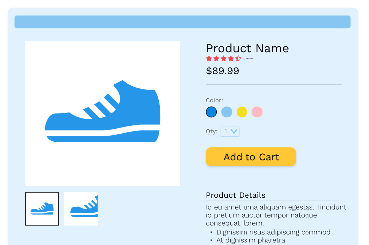
One of the most important parts of your e-commerce site is the product page. This is a key stop on your customer’s journey, and it needs to be designed strategically to maximize conversions. Use research-based best practices to make it easy for potential customers to make a purchase.
1. Don’t Skimp on Product Image Quality
Online customers shop with their eyes, so your product images should be visually appealing and accurate.
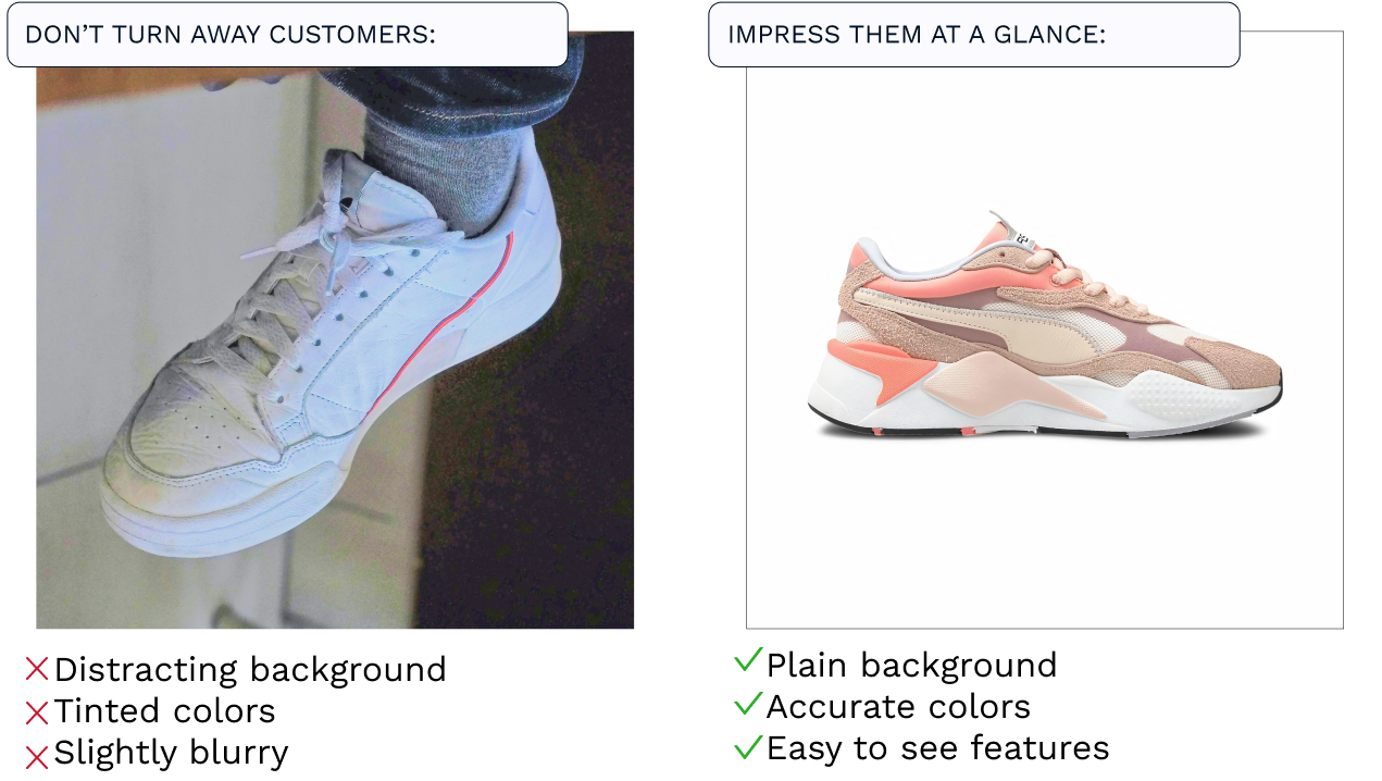
Product images should capture the potential customer right away. Take clear photos in well—lit locations free of distractions. If you put your photo in front of a background, choose a background you can use consistently across all of your product images like a certain wall or texture. Even better: use a white background so your images take center stage. And even better than that…hire a professional photographer to take those pics!
One extra tip: Studies show that pictures of real people draw the eye better than stock images or products alone. That means that, when appropriate for your products, pictures of people interacting with them will resonate with your potential customers.
2. Master Your Call to Action: Add to Cart
The goal of any product page is to get that user to hit the Add to Cart button, so its design and placement must be strategic. To optimize this button:
- Place it above the fold, meaning place this button high enough on the page that the user doesn’t need to scroll to find it. Usually, this means the button is below the product title and above the product description.
- Use a color that draws the user’s eye…and don’t use that color for any other button on the page.
- Use text that clearly indicates what the button is going to do. “Add to Cart” is common because it’s concise and clear. Customers are used to that language and know what it means. Unless you want the button to take the user right to your checkout process, avoid using “Buy Now.” If you want the customer to be able to checkout immediately, (reframe positively)
3. Reviews and Ratings
As much as you can, include reviews and ratings on your product pages specific to that product. These build trust and credibility. These days, customers seek them out. In fact, 84% of users trust online reviews from strangers as much as word-of-mouth and personal recommendations. Reviews reassure customers that the product is high quality and as advertised. And don’t worry if you are starting with only a few reviews…you don’t need that many reviews. Products are 270% more likely to sell with as few as five reviews.
4. Mobile Accessiblity
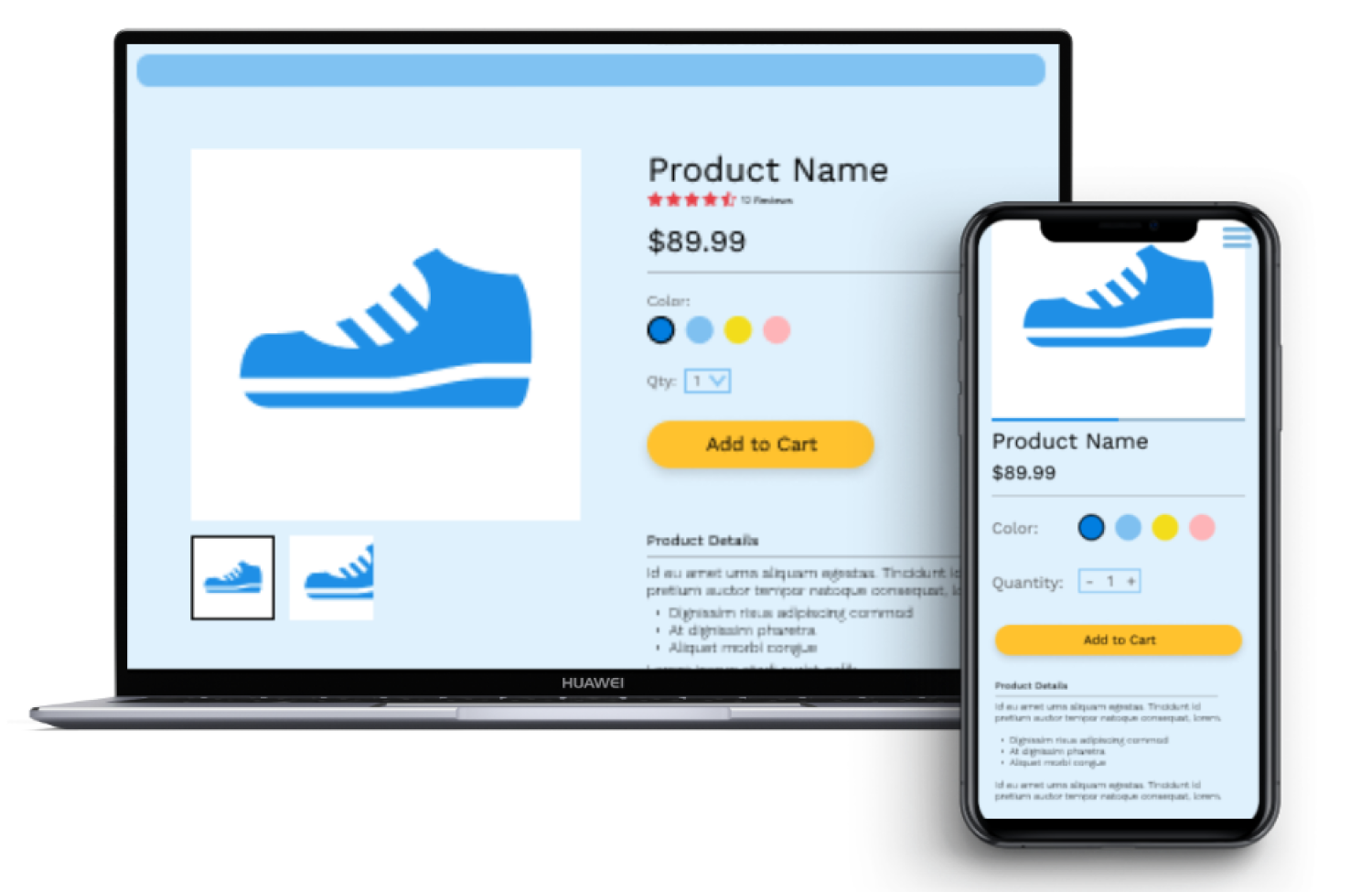
More and more customers these days make purchases on their phone, and the number is increasing. Currently, over 72% of online purchases are made through a mobile device. Make sure you check that your product pages look as incredible on mobile as they do on desktop. This is also a chance to simplify your pages – fancy elements are hard to scale down to mobile and add friction to the user experience.
Here’s the thing…
Here’s the thing: your product pages are super important to your e-commerce page. There’s a good chance your marketing will take users to your product pages rather than your home page. The goal is to make the experience familiar and easy for users so they can quickly tell how great your product is and add it to their cart. By prioritizing the elements above, you’ll be well on your way to that ideal product page that maximizes conversion!


