The average person spends seven hours of their day online. With so many websites and social media channels vying for attention, it’s critical to understand how the brain decides what to give attention to and what to ignore.
Remember from Part 1 (How the Brain Processes Information and Why It Matters in Marketing): The Reticular Activating System, or RAS, is the brain’s bouncer. This pinky-sized part of the brain determines if we should give conscious attention to something (like what your date is talking about in a restaurant) or if we can ignore it (like other people’s conversations in that restaurant). To get someone to stop scrolling and look at your website or ad, you need to send a clear signal to the RAS that you are worth the mind’s conscious thought.
There are six approaches for getting on the VIP list so the RAS bouncer lets you through:
PERSONAL
VISUAL
TANGIBLE
CONTRASTABLE
MEMORABLE
EMOTIONAL
The highest impact approach that you can use right now in your marketing efforts is VISUAL. 30% of the human brain is dedicated to its visual system, which is the largest area of the brain dedicated to one system. It follows, therefore, that images and pictures will have the largest impact in capturing attention. Content with visuals gets around 94% more views than content without visuals.
You’re probably already using visuals in your content. So now the question is – which visuals work best?
The Right Visuals Make the Right Impression
There are unlimited ways to present your content visually, but only some will get your messaging past the bouncer. One technique is to appeal to the viewers’ emotions. Take a look at how visuals and emotions work together in these ads.
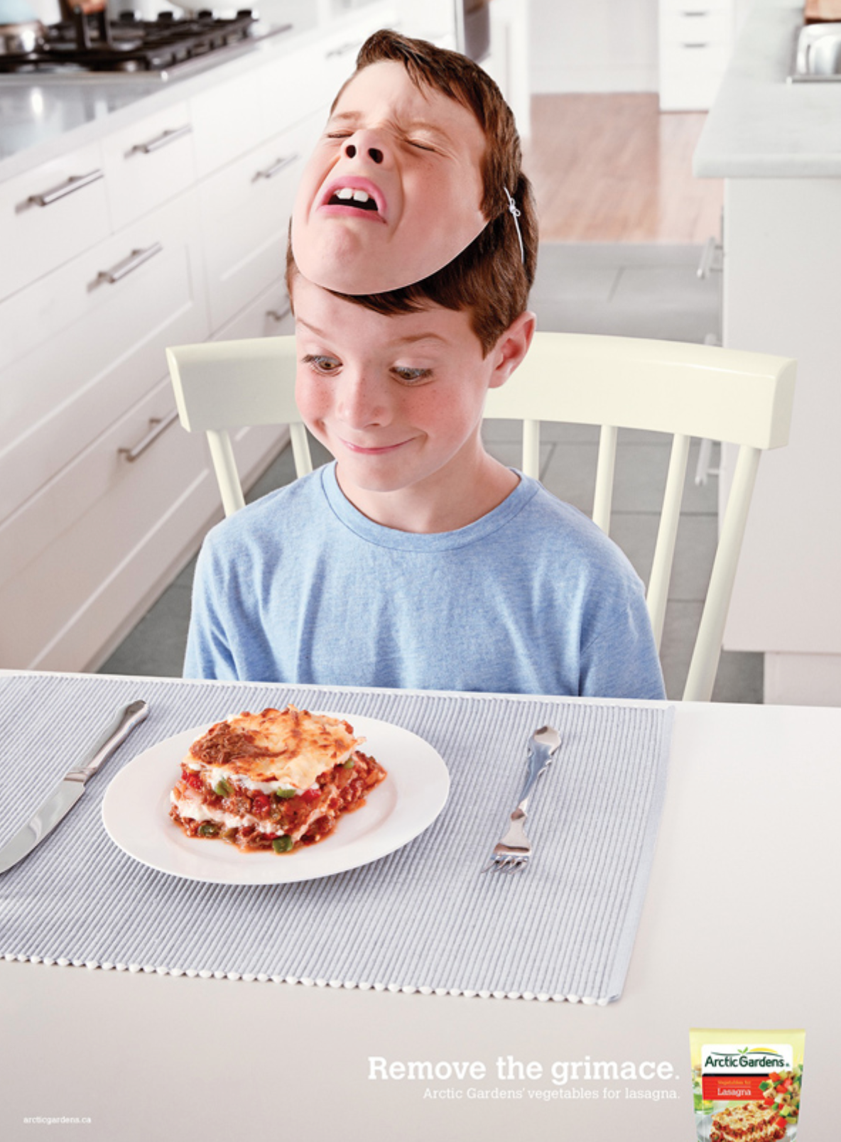
This image has immediate emotional impact. The two faces have a striking contrast and present a relatable situation. It’s clear how this meatloaf differentiates itself – it’s not just good meatloaf, it’s meatloaf that your kids will like. For any parent seeing that ad, that is a huge draw!
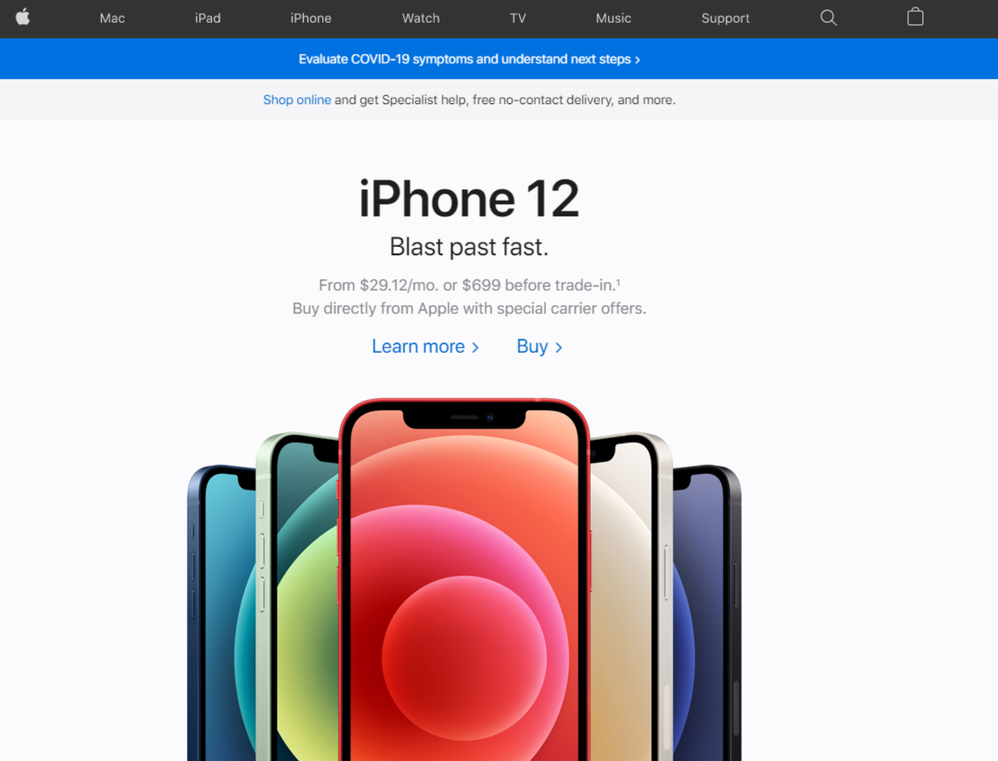
Another technique is to draw in the viewers’ attention with clear visual hierarchy and a focus on the product itself.
Apple is the master of using composition to draw people’s eyes to their products. This is an easy ad for the RAS to focus attention on. The iphones are front and center. There’s nothing else to look at to distract the viewer.
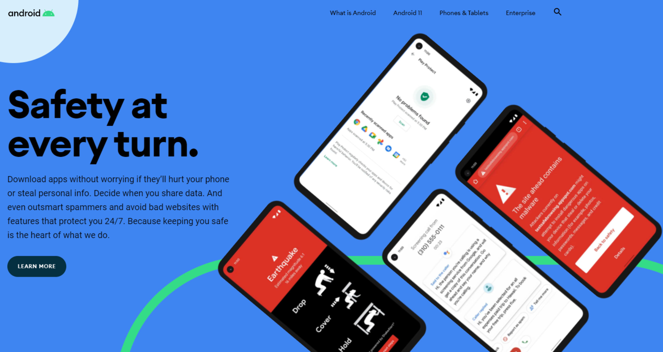
Unfortunately, Android doesn’t win attention with this design. It’s not clear where the eye should look because the visual is cluttered. While Apple’s website’s sleek look matches the sleek, modern technology they’re selling, Android’s website is cluttered with colors and shapes. It’s a missed opportunity to get attention on their products.
The Right Colors Make the Right Impression
The science behind the impact of color on our brain is impressive. Let’s compare red and blue.
In an experiment comparing the effects of red or blue on people’s ability to complete tasks, red increased performance on detail-oriented tasks (memory retrieval, proofreading, etc) by 31% compared to blue. On the other hand, when scientists experimented with creative tasks, participants created twice as many creative outputs when in a blue environment than in a red one.
When the background color of a product or product imagery is red, people showed preference for ads that featured specific product details. When the background color is blue, people showed preference for ads with creative messaging and imagery. For example, in one study participants were shown a new fictional toothpaste brand. They were more receptive to negative messaging (“cavity prevention”) when the ad was on a red background, and more receptive to aspirational messaging (“tooth whitening”) when the product was on blue.
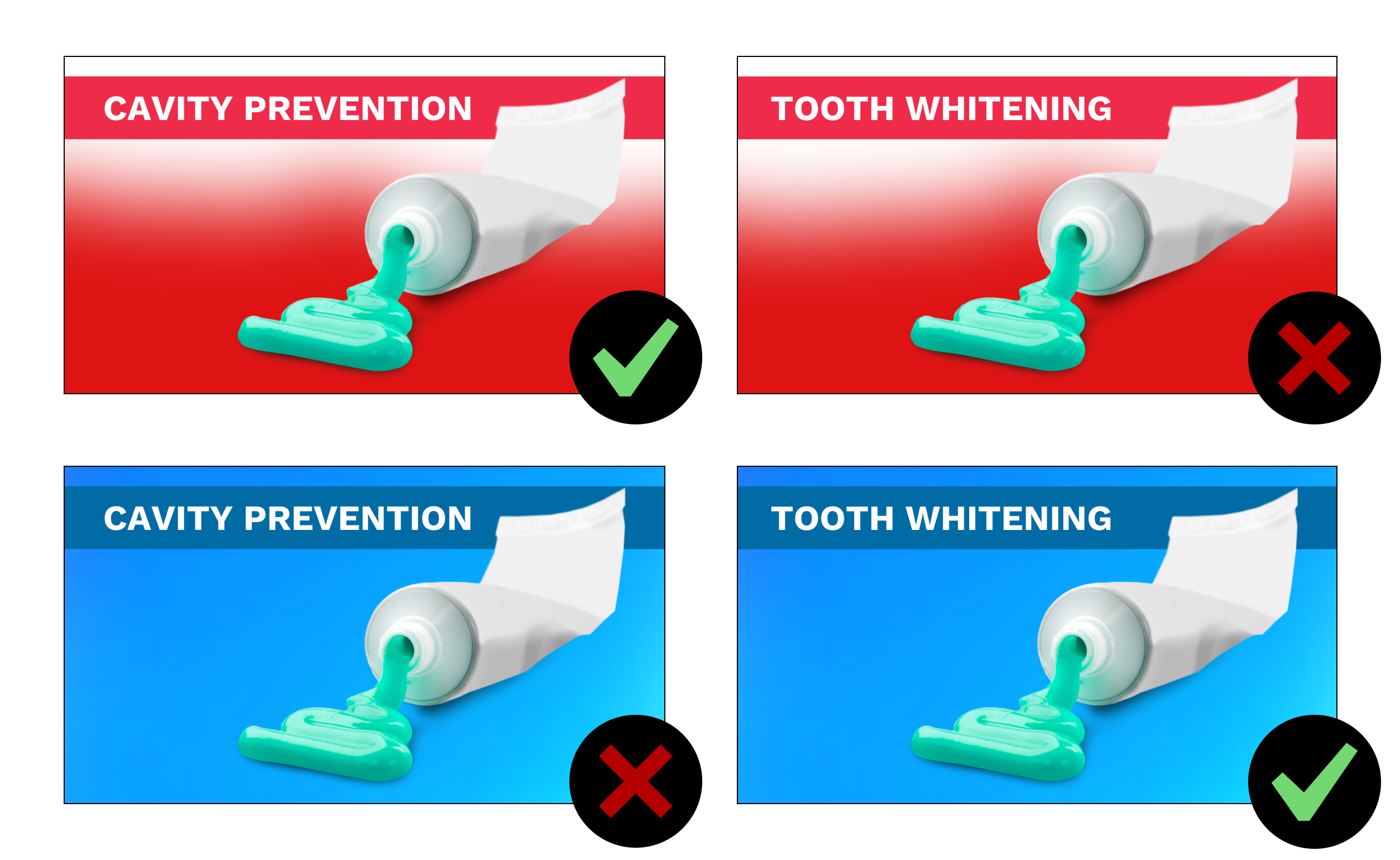
Colors matter. There’s a reason why so many fast food chains use so much red in their branding; red encourages appetite. Check out this article for a detailed infographic about what different emotions evoke.
Try the 5-Second Test
To test if your marketing visuals are getting you past the Reticular Activating System bouncer, perform a 5-second test on your website or ads. In a 5-Second Test, a user is asked to view your graphics for five seconds only. Then they are asked to describe what they saw. If users can’t tell what you do, what makes you unique, and what’s in it for them as potential customers after viewing your visuals for five seconds, it’s time to make a change!
Try https://www.photofeeler.com/ for testing pictures of people to see how others react to them.

